Why Is Data Visualization Important In Your Blog Writing?
Do you think it is a good idea to visualize all your data most appealingly when writing a blog? If you think it is a good idea, then you are absolutely right, and this is something we can all agree on.
Visualizing your data is the most effective way to make your blog look appealing. It helps in ensuring that your article looks interesting and keeps the reader’s attention span on the page for a longer time.
Therefore, if you want to learn how to visualize your data properly in your blog articles, then give this article a read. After going through this blog, you will understand why data visualization is beneficial for your business. You will also get to learn about what new visualization trends you need to watch out for in 2022.
What Is Data Visualization?
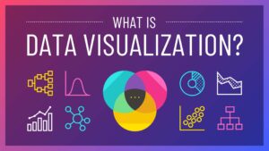
Data visualization is the process of presenting data in your articles in the most cohesive and visually appealing way possible. Visualization of data helps readers to understand what’s written in the easiest way possible. It also ensures that readers find the data presented on the web page interesting to read.
Presenting information in the most cohesive way possible to readers is the primary motive for bloggers. This is because people who surf the internet look for blogs to read on Google and look for relevant information. They will only be happy if they get the information they are looking for.
Why Is Data Visualization Important For Blogging?
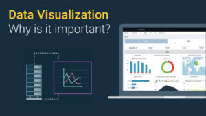
Data visualization is very important for blogging because:
Makes Your Data More Interesting And Engaging

The primary objective of data visualization is to ensure that complicated pieces of data get broken down and simplified. Breaking down complicated data into smaller chunks and explaining each smaller part more elaborately is what readers want most.
Therefore, if you present the data in a very cohesive and visually appealing way will help a lot. It will ensure that the readers will stay on your page for a longer time and lower the bounce rate.
Helps Readers To Decide Faster

Sometimes, readers do not have the time to go through an entire blog in the time they have in their hands. This is why many bloggers and content writers try to present their data in the most streamlined way possible.
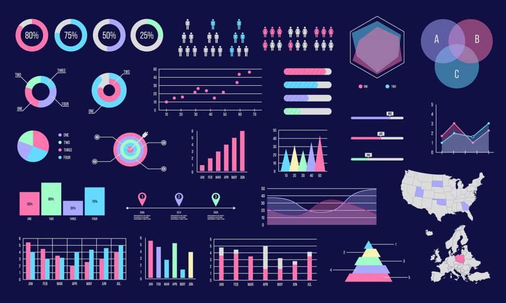
It is important to do so because it helps the readers understand what the data represents. Presenting data in visual forms like using tables, charts, diagrams, and infographics makes them interesting to read through.
Therefore, instead of reading the entire article, readers can simply scroll down and read these visual representations to get the information they need faster.
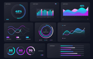
Data Visualization Trends To Watch Out For
There exist various ways to visualize data. Since newer applications and updates to older ones are being constantly rolled out, new trends are arriving on the scene every day.
Therefore, it has become important for content creators to constantly stay updated with the various techniques of data visualization. Some of the newer techniques that have trendy right now in 2022 are:
Graph-Based Analytics
In order to find the relationship along with its similarities and differences between two different but related data, graphs are one of the best tools you can make use of.
Graphs present the relationship between two different sets of data and figure out points where they intersect and almost act the same or the opposite of it.
Therefore, if you use graphs to represent data, you can explain various topics in a very clear and coherent way. This has become trendier because new formats of graphical; representation have been made accessible.
Now you can create pie charts, smart arts, and lots more through writing applications like Microsoft Word and Google Docs.
Real-Time Analytics

Getting insight into data that is constantly fluctuating in real time has become essential in some niches of blogging. For example, when it comes to writing articles about the stock market, it is essential for readers to know the current price of stocks.
Therefore, providing older data that includes the price of stocks is pointless if it constantly changes on a regular basis. Therefore, using certain applications to visualize highly volatile numbers and data has become necessary when stock market content creation is concerned.
Conclusion
Data visualization has become a key concept in content creation, especially for bloggers. This is because using various forms of visual representations of data has become a necessity because readers find graphical representations of data very interesting to read. This increases the readers interest in the webpage and even keeps the bounce rates pretty low.
READ MORE: